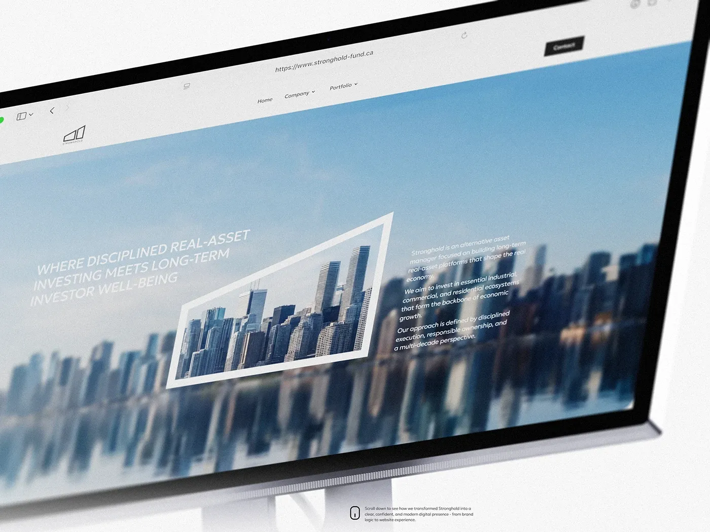
Wine Bureau
Branding

“In wine there is wisdom, in beer there is freedom, in water there is bacteria,” said Benjamin Franklin.
We recommend following a healthy diet and drinking 2 liters of water per day. But even doctors recommend drinking a glass of good wine to up your mood and keep your heart strong. And thanks to the Wine Bureau, you’ve been able to buy great quality alcohol at a fair price since 2006!
Wine Bureau is a direct importer of 4,000 wines and 1,000 spirits from 40 countries, as well as accessories and health products.
As part of our cooperation, going on since 2021, our Superheroes. team developed more than 20 packaging and wine tube and wine rack designs. Let’s look into several examples of packaging.
Client
Wine Bureau
Responsibility
Brand Identity
Project Category
Branding


For Black Velvet whiskey, traditionally a man’s drink, we chose black as the main color. Wine Bureau’s marketing team suggested adding two accentuated red maple leaves, which drew the right associations, making it clear that the whiskey is Canadian. Maple is known to symbolize male beauty and also wealth. To emphasize this, in the 2nd variant, we placed three gold leaves. Variations of the color range (black/silver/red and black/gold) add refinement and elegance to the product and attract customers’ attention to the shelf.

Our design aimed to emphasize the naturalness and quality of the drink. Plant elements and spices, while serving as communicative elements, give the consumer an initial idea of the product. They evoke associations with a traditional lifestyle. Moreover, naturalness is expressed not only in colors, but even in craft paper used in making the box.


Our design aimed to emphasize the naturalness and quality of the drink. Plant elements and spices, while serving as communicative elements, give the consumer an initial idea of the product. They evoke associations with a traditional lifestyle. Moreover, naturalness is expressed not only in colors, but even in craft paper used in making the box.