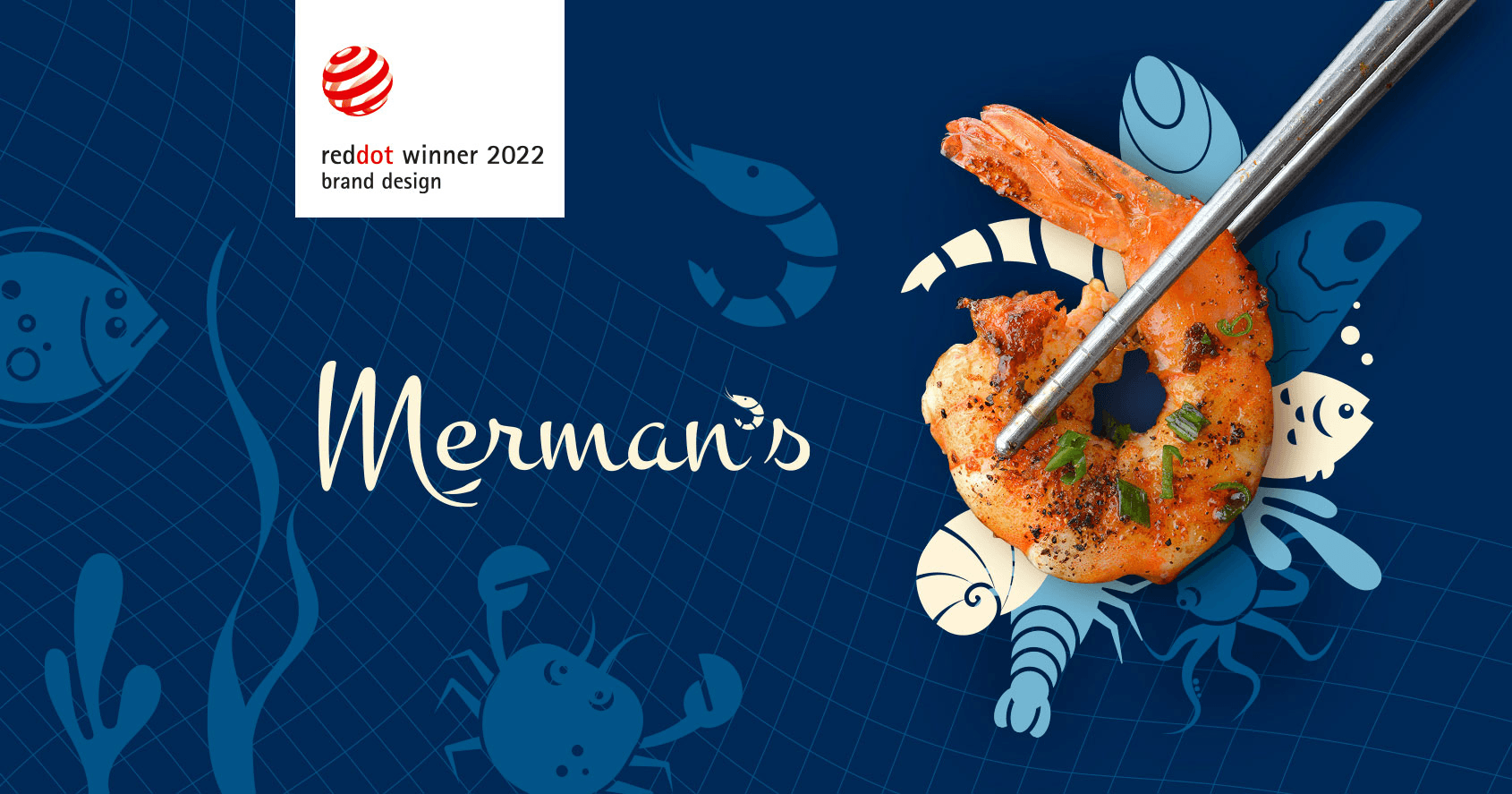
Merman,s
Branding

Have you ever wondered what a thorny path an ordinary shrimp overcomes before getting on the Ukrainian table?
And in general, how can it come to us from abroad? If it is transported fresh, it will simply spoil…
Before we met Merman’s, we thought it was impossible. And it turns out everything is possible! To understand the brand and the work of the marine food industry in general, Superheroes.ua have plunged into the Pacific underwater world.
And as a result, they created a real sea extravaganza – a new corporate identity for the largest Pacific shrimp farm Merman’s.
But first things first…
About Company
MERMAN’S is the largest Pacific shrimp farm Penaeus Vannamei in Europe, which opens a new page of Ukraine’s innovations in the field of seafood.
The location of the Tiligul estuary (Odessa and Mykolaiv regions) was chosen for the location of the farm. The water in the estuary is almost identical in biochemical composition to the marine water of the Pacific Ocean, where Penaeus Vannamei lives in natural conditions.
Client
Merman,s
Responsibility
Design + Framer Development
Project Category
Branding
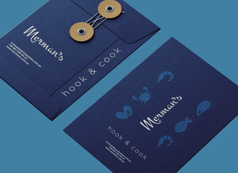
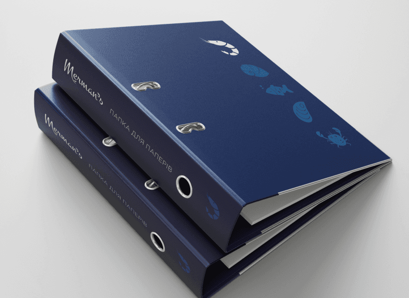
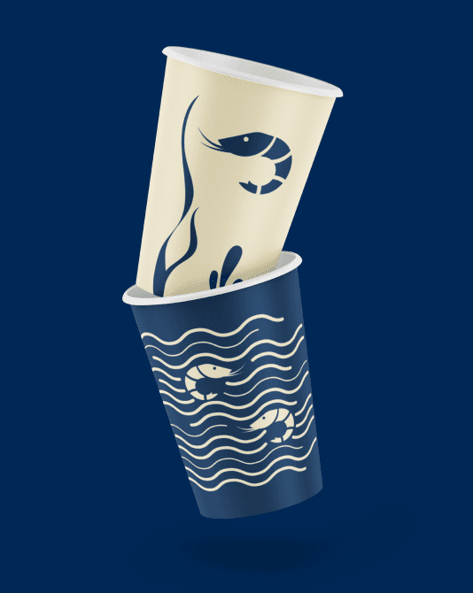
Our Customer, Merman’s brand, is the only Pacific white-legged shrimp farm in Ukraine that works to develop a culture of fresh fish and seafood consumption in Ukraine. And it was important for us to take this into account when working on the brand. After all, the visual components must combine the key values of the brand: leadership, technology, environmental friendliness and a crazy love for shrimp and the whole marine world.
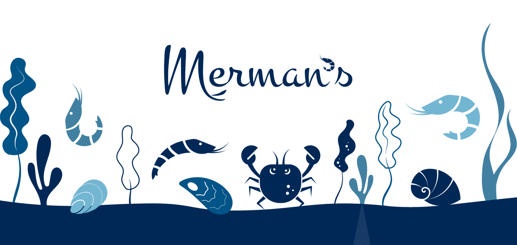
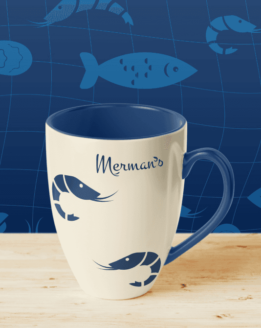
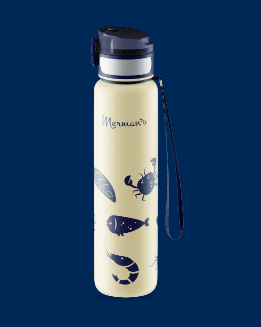
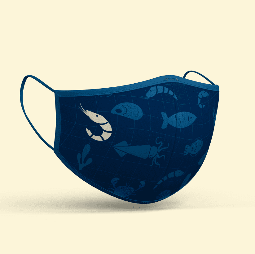
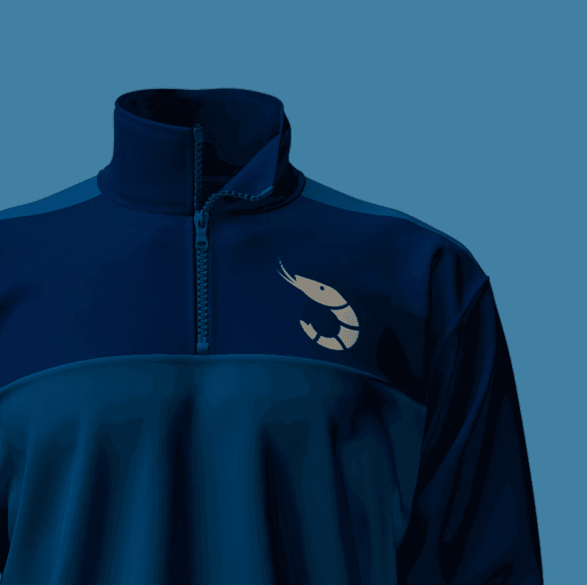
We couldn’t imagine the Merman’s logo without the shrimp. Therefore, it organically complemented the font of the brand and became our key brand symbol. In the main logo, the shrimp acts as an apostrophe and participates in the stylization of the letter M (its adaptation repeats the shape of the shrimp tail).
And on media where the main version of the logo can not be used – shrimp can be used as an alternative (for example, in the favicon of the site).